Hughes Price Walker Pension Portal
Complete redesign of a pension management portal to modernise client access, reduce administrative workload, and position Hughes Price Walker as a digitally capable provider. The goal was to create a streamlined, user-centred platform that improved efficiency for staff while offering clients a clearer, more intuitive experience.

Hughes Price Walker
Bristol, UK
Pensions / Actuarial
42%
Staff data requests
57%
Reduction in routine client enquiries
4.6/5
User satisfaction
Challenge
Hughes Price Walker relied on manual processes to provide pension information, which created inefficiencies for staff and a frustrating experience for clients. The absence of a dedicated digital platform meant long response times, frequent queries, and a lack of self-service tools. The challenge was to design a solution that modernised these processes while working within the constraints of HPW’s existing brand.
Results
The new portal delivered a streamlined, accessible, and responsive platform that significantly reduced the time clients spent accessing their pension information. By extending the existing brand with a clearer hierarchy, a flexible illustration system, and a focus on usability, the design improved both client satisfaction and staff efficiency. Early feedback has highlighted faster access, fewer routine enquiries, and a more professional digital presence that aligns with HPW’s strategic goals for 2025.
Understanding the Problem

Research & Planning
Defining user journeys and priorities
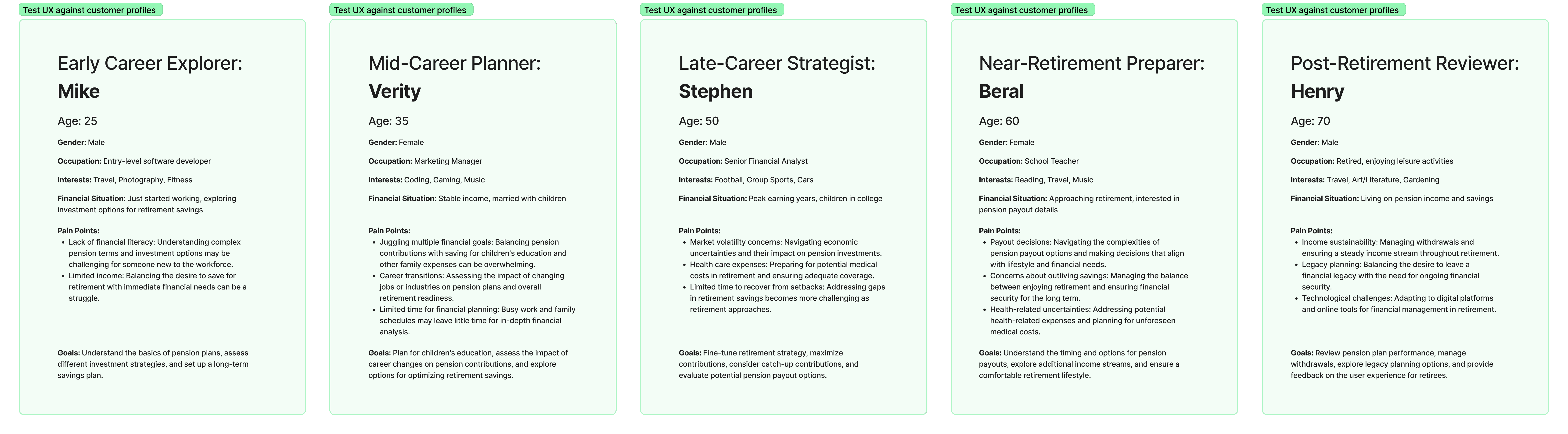
The first step was to clarify what clients and staff needed most. Working with internal stakeholders, I mapped the most common client requests and structured them into clear user journeys. Using FigJam, I identified four key priorities:
Secure and simple login
Access to pension balance and history
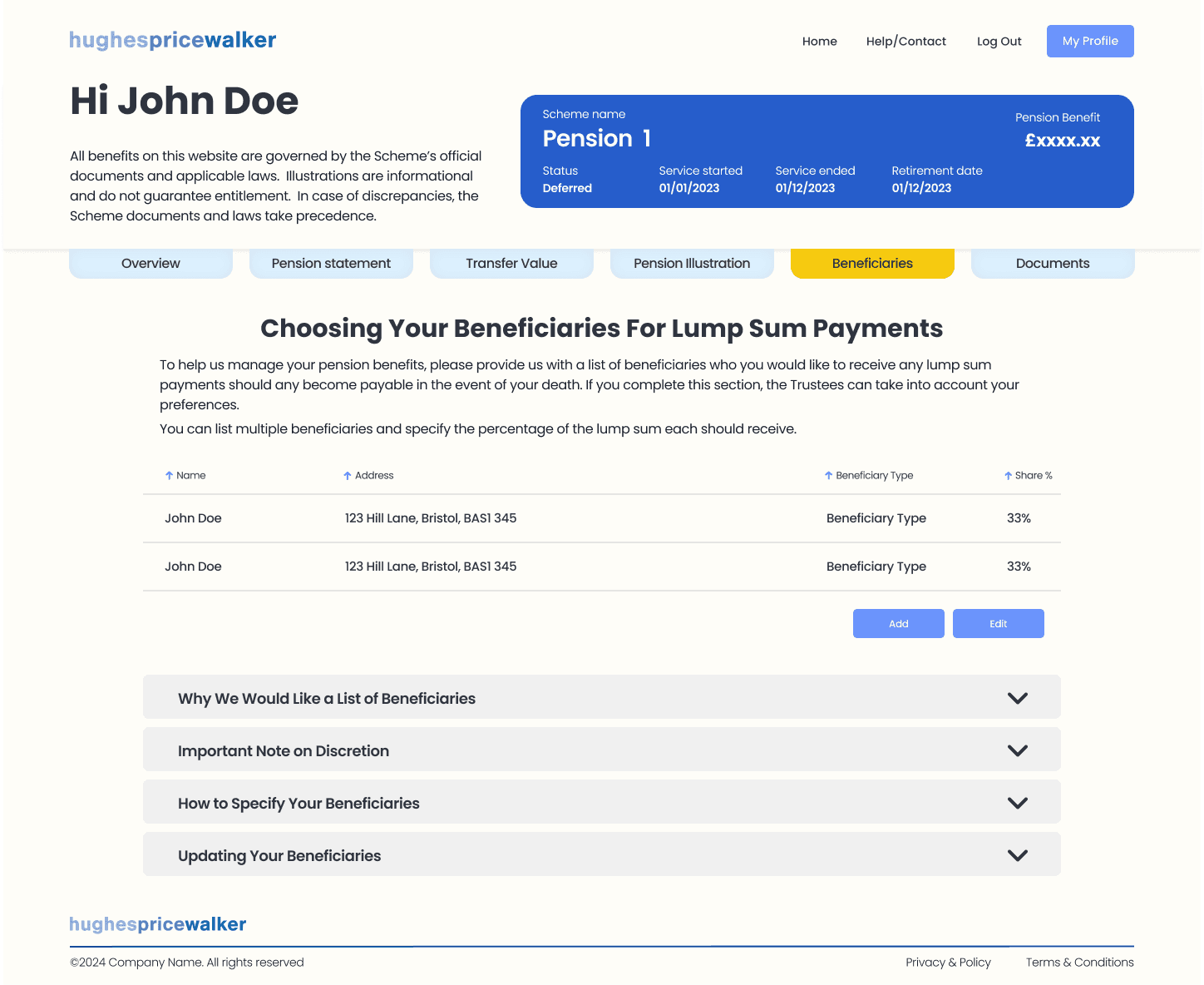
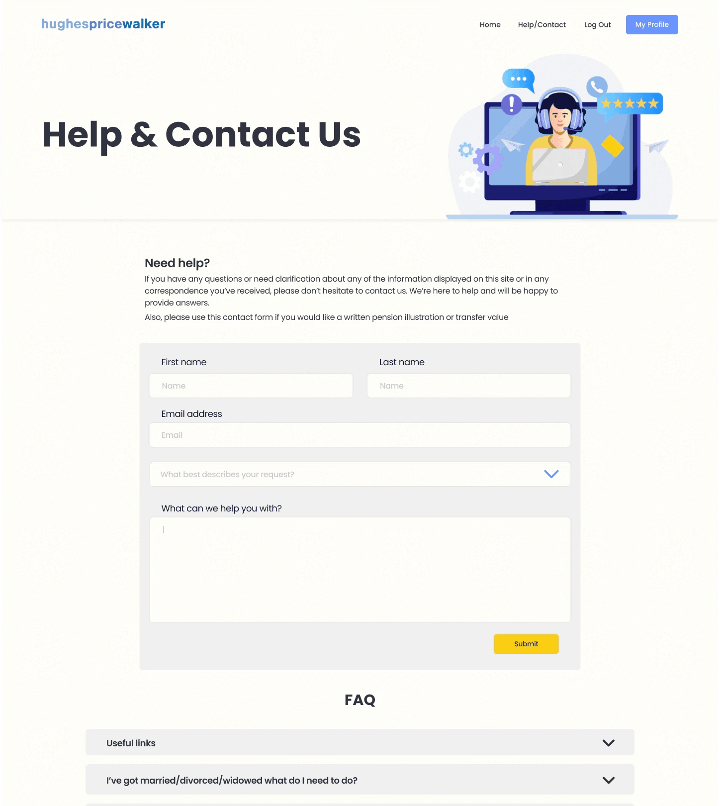
Ability to download key documents quickly
Updating and managing personal details
These flows revealed where friction existed and highlighted opportunities to remove dependency on staff intervention. The planning phase gave us a roadmap that balanced user needs with HPW’s operational goals, ensuring the portal would be both practical and impactful from launch.


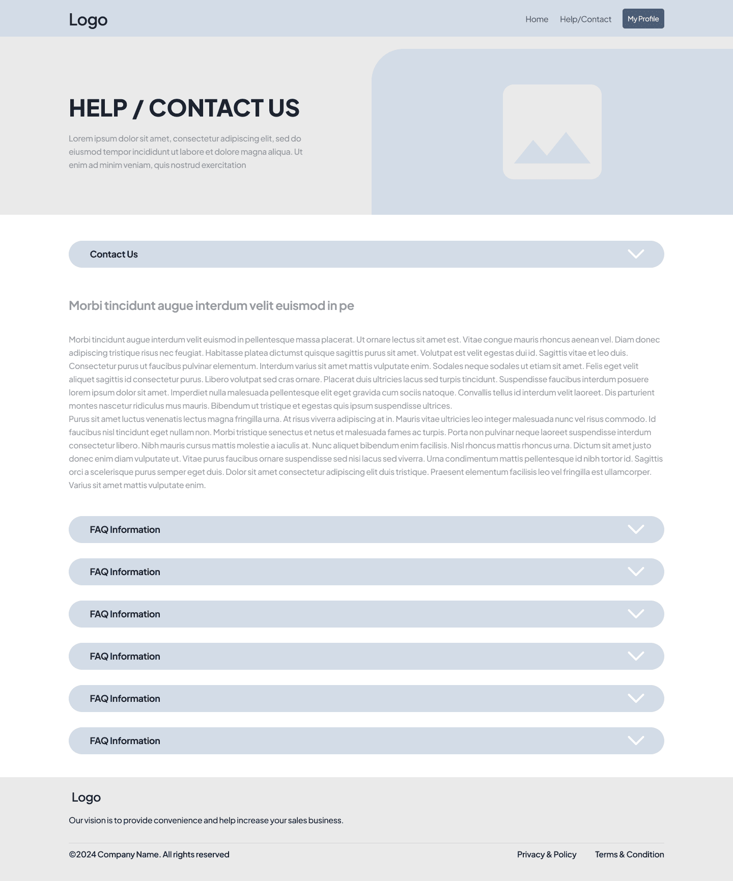
Wireframing
Exploring structure and usability
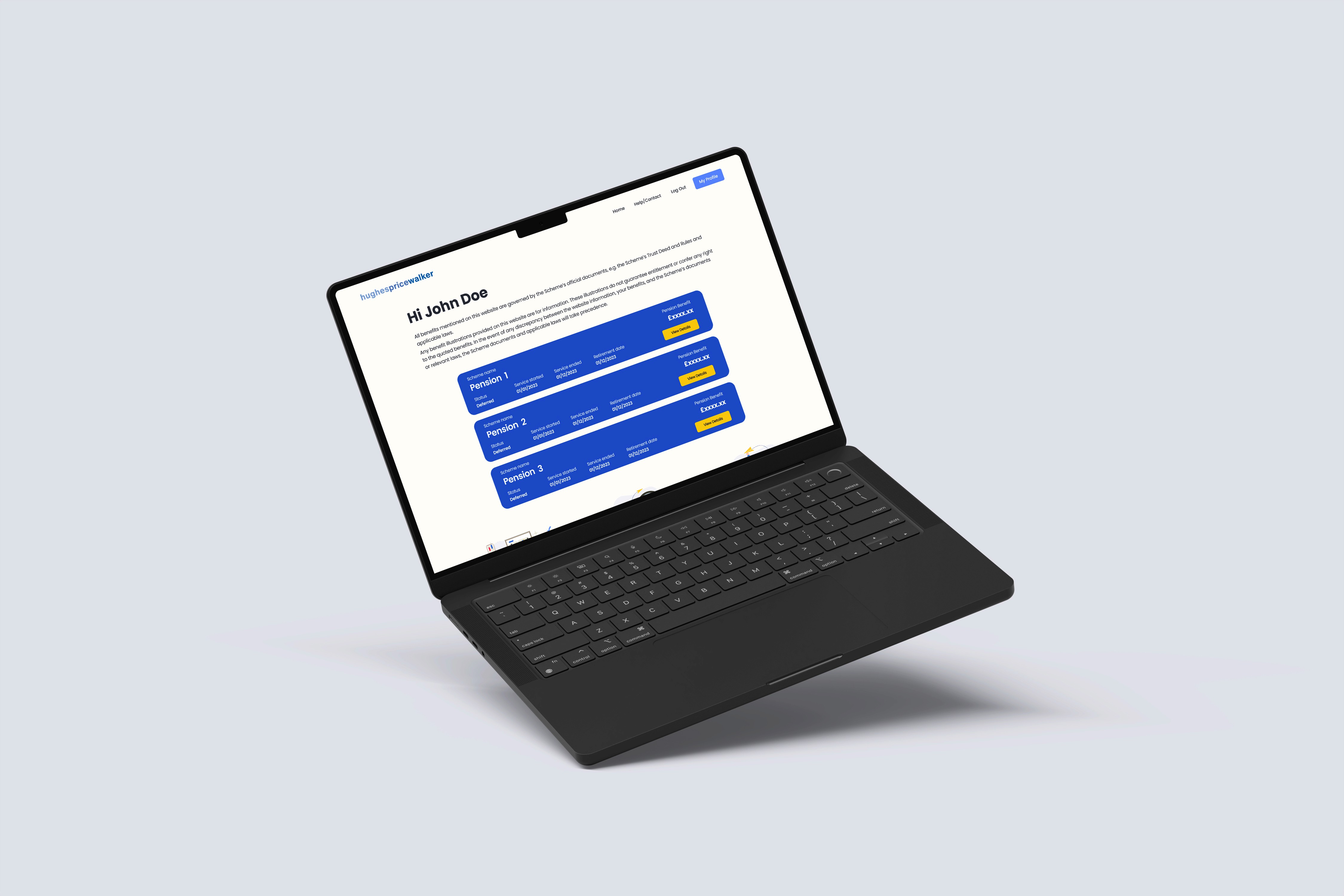
With the user journeys defined, I created low-fidelity wireframes to test structure, navigation, and hierarchy. These wireframes helped visualise the client dashboard, data displays, and form interactions in a stripped-back way, making it easier to focus on functionality before layering in design.
Through iteration, I refined layouts to ensure that common tasks could be completed with minimal clicks and without ambiguity. For example, the dashboard view was simplified to surface balances, contributions, and document downloads upfront, while secondary tasks were grouped logically in supporting menus.
By sharing early wireframes with stakeholders, I was able to validate assumptions and reduce the risk of rework later in the process.


Visual Design
Modernising within existing brand constraints
Although HPW has plans for a broader rebrand, this project needed to launch ahead of that work. The challenge was to create a digital experience that felt modern and intuitive without deviating too far from the existing identity.
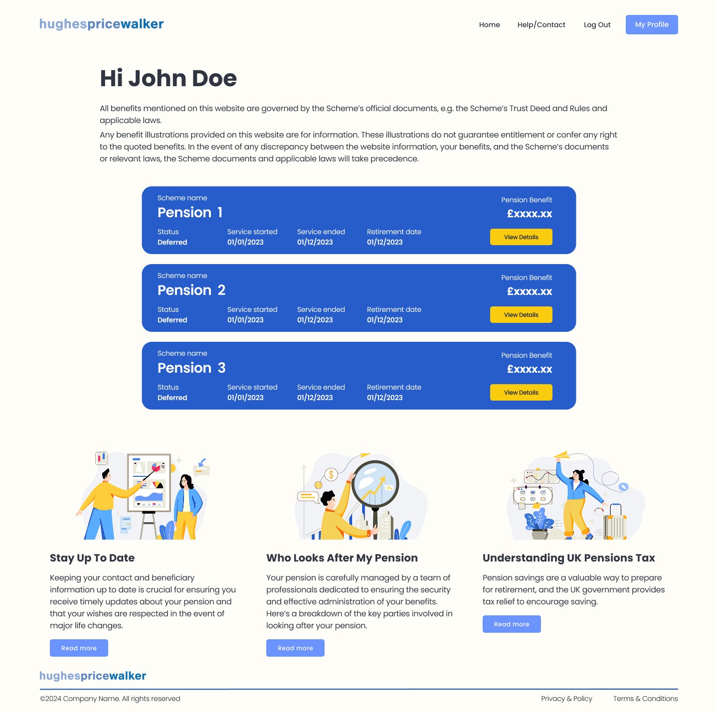
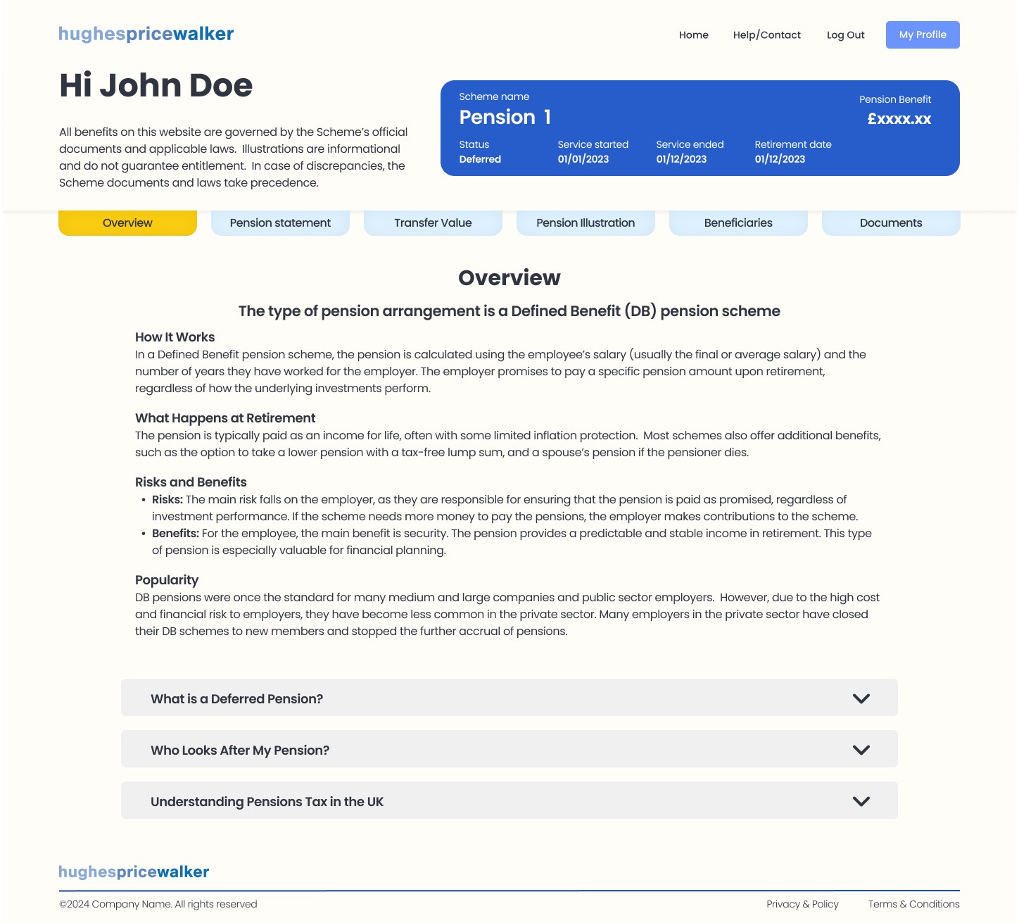
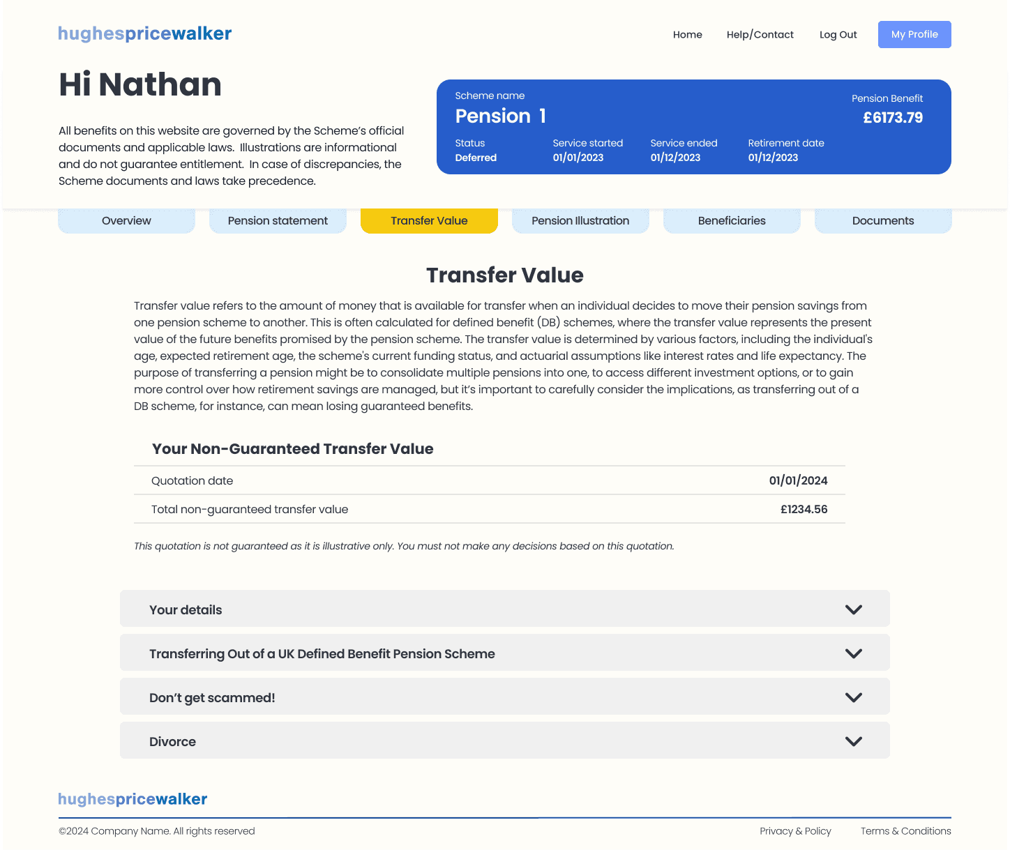
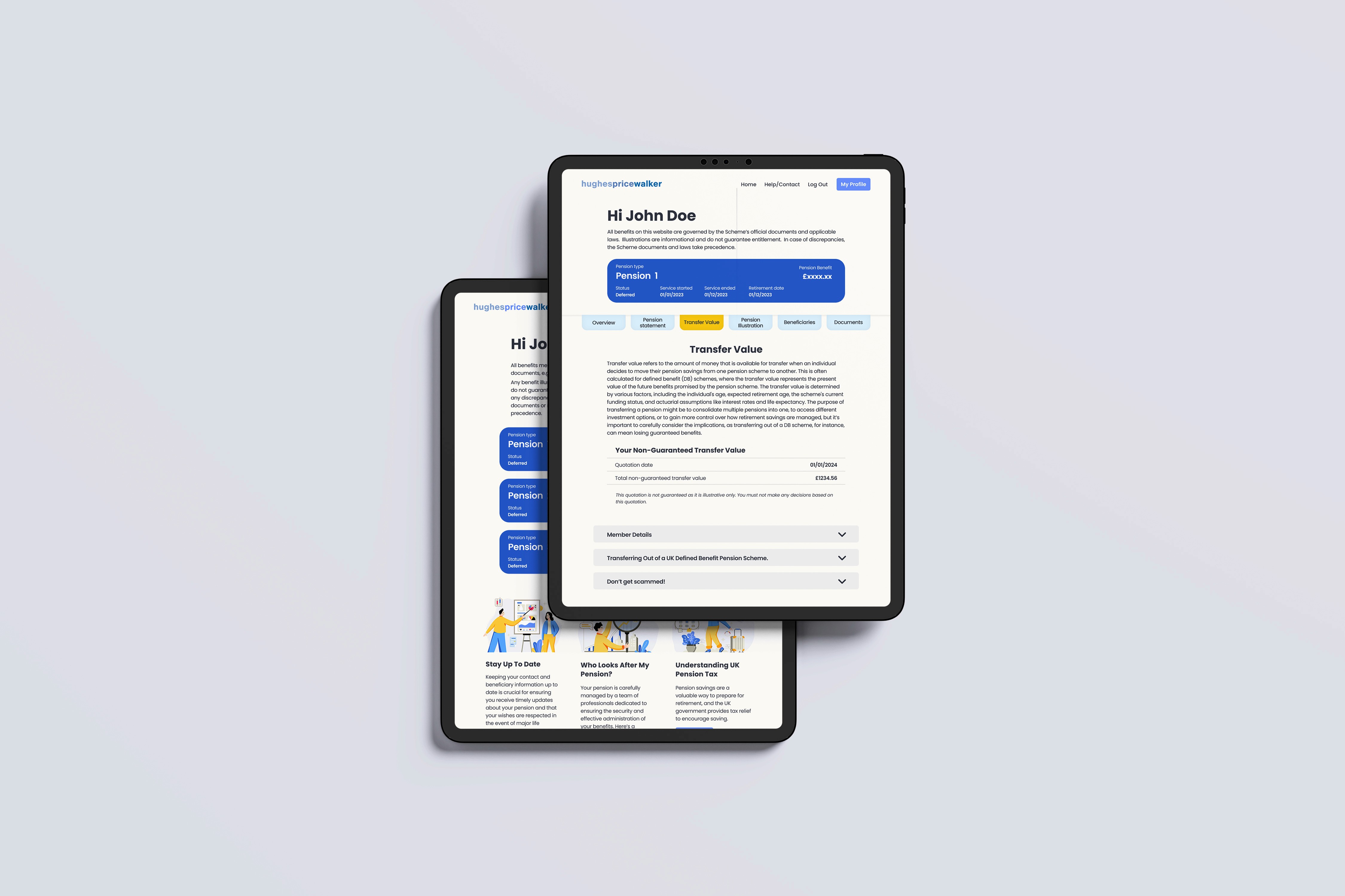
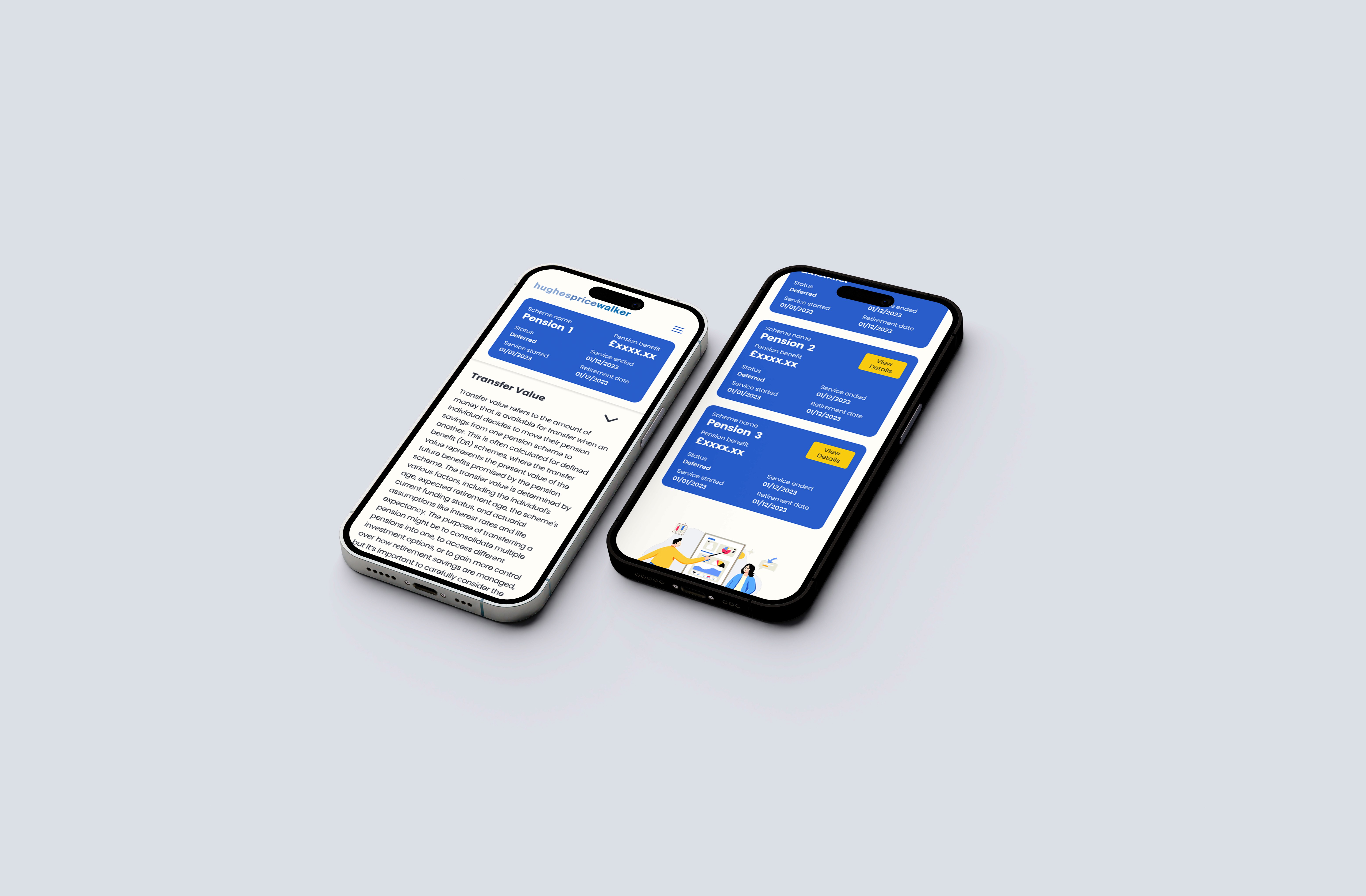
To achieve this, I extended the colour palette, introducing stronger contrast to guide attention to key actions and data points. Deep blue panels grouped pension scheme information into scannable sections, while bright yellow call-to-action buttons offered immediate visibility.
Typography was chosen for clarity and legibility across devices, with clear hierarchy between headings, data, and supporting information. To avoid the cost and inconsistency of stock photography, I developed a custom illustration system. These simple, friendly illustrations provided visual engagement without clutter, keeping the overall interface clean and lightweight.
The result balanced professionalism with approachability, respecting the brand while delivering a digital-first experience.
Prototyping & Testing
Validating design decisions through iteration
High-fidelity prototypes were created in Figma to simulate the final portal experience. These prototypes were tested using Maze, enabling rapid collection of feedback on usability and clarity of flows. Testing sessions focused on the key journeys defined in planning, such as logging in, checking balances, and downloading documents.
Feedback revealed opportunities to simplify form fields, clarify navigation labels, and adjust hierarchy to make critical data more prominent. These insights directly informed refinements to the design, ensuring the portal was not only functional but intuitive.
To maintain alignment with internal teams, I recorded walkthroughs using Loom, giving stakeholders and developers a clear view of the design intent. This approach kept collaboration efficient and allowed for fast iteration without the need for lengthy meetings.
Final Delivery
A responsive, accessible pension portal
The completed design delivered a responsive, accessible platform that worked seamlessly across desktop, tablet, and mobile. Clients could now log in securely and perform key actions independently, reducing their reliance on staff intervention.
For HPW, the result was a measurable reduction in repetitive queries, freeing staff to focus on higher-value work. Early feedback from users confirmed improved satisfaction, quicker access to information, and a stronger perception of HPW as a modern, digitally capable provider.
By balancing usability with brand constraints, the project delivered a clear step forward in HPW’s digital transformation, helping to lay the foundations for future innovation and supporting the company’s 2025 strategic targets.
“Nathan’s work has helped us modernise our services and present ourselves as a forward-thinking, digitally capable business. We now have a professional, intuitive platform that supports our clients while making life easier for our staff.”
Ray Hughes
Director | Hughes Price Walker